
Jasper Ave
According to Foucault, the subject never views an image autonomously. Images are not viewed alone but are embedded in a complex network of contexts. Media images are made to be viewed by particular viewers in particular spaces. The physical context (location), historical context (present day) and images within the media are combined with the perception of the subject to create meaning: The subject/viewer is a developed through relationships of power that are performed through discourses. The viewer is caught in a paradox of knowing the media image is for all people who view it, but also specifically directed at them, with regards to the personalization of information in the media. Band posters are no different. They are designed to attract the attention of all potential viewers, while containing messages which only a specific audience my have access to understanding. In order to interpolate the information in band posters, knowledge of discourses regarding social norms, fashion, technology, music culture and consumerism are required. Requiring this knowledge to understand some band posters implies a difference of power between those who have access to that information and those who do not.
 In this poster, advertising both Hawksley Workman’s upcoming performance and album, there are a number of messages embedded for viewers to decode. The first message is the ‘postmodern hipster’ message. Hawksley’s stance is relaxed: Standing cross legged with a slight lean back. He is wearing a toque, large yellow sunglasses, a western style shirt and sneakers. He has a goatee and his guitar strings are unruly. Hawksley’s style indicates he probably has a folk/rock/hipster attitude towards his style, which can probably be further interpolated as a folk/rock/hipster music style. This message, however, can only be decoded if you have knowledge of contemporary fashion and music styles. This laid back hipster vibe is carried through in the physical elements of this poster: the picture of Hawksley is taken from a low interesting angle, the colour theme is soft blues and yellows, and his name is written in all lower case. The location of his upcoming performance also provides messages as to the kind of music which will be performed. This knowledge is only accessible if you know details about the venue (i.e. it will not be a deafening arena rock concert with pyrotechnics at the Winspear). On the bottom right is an image of his CD. The postmodern vibe is here as well in the album artwork: There is a cubist style to the background images of a woman’s chest and cityscape. A stylized image of his face is in the center, again with a toque and large sunglasses. To understand the codes being communicated by the image requires that you have an understanding of art styles and that you know this image is his album cover artwork. On the bottom left side there is a small barcode looking box. This little box is a new type of advertising technology which requires a smart phone to unlock. When you take a picture of the barcode through an application on your phone, it links you up with special multimedia information. It connects you to a website where you can access more visual media about Hawksley. The messages contained in this little media barcode are only available to those with the knowledge of what it actually is and the technology to access it. This is also true for the websites listed on the poster. There is no information about how to get tickets to his show, just a website for the venue and the Hawksley Workman site. Without access to the internet, further information than what is on the poster is not available. All messages within this poster are designed to entice the viewer to purchase tickets to Hawksley’s performance or his newest album. These messages, although directed to anyone walking along Jasper Ave, require a fair amount of diverse knowledge to understand.
 The posters along Jasper Ave are in designated postering areas like poster poles, bulletin boards, bus stops and abandoned buildings. There are much fewer local, unsigned band posters than there are posters of signed bands and bars advertising DJ shows. Postering sites are rather disorganized and messy. The band name is usually the largest piece of text information and the date is much smaller. Some images provide information as to what kind of music they play where other images, especially for DJ shows, seem chosen to capitalize on the glance. That is, to grab your attention. Posters put out by promotional companies are clearly distinguishable from independent posters. Usually the bands in those posters have been signed to a record label and their band names resemble brand names with characteristic style and font (Muse, Soulfly, Motley Crue, Billy Talent, etc.). This is also true of DJ promotional companies. Both the bar name and promotional groups names look like logos or brand names (Level 2, Pawn Shop, Fluid, Brixx, New City, Easy Love, Oh Snap! etc.). The brand name style grabs people attention and makes sure that the name is easier to remember as there is a consistent font style or logo look to it. This style also helps indicate the probable music style (Boated Pig (metal music, creepy font) vs. Basia Bulat (country/folk music, pretty calligraphy). The postering aesthetics in Edmonton are only really effective if one has time to stop and look. There are often so many in the areas where postering is allowed to fully take advantage of the glance. Viewers need to weed through the mess in order find a show they might enjoy. The posters themselves and their design styles help to make this process more quick and easy, and in that way, their individual aesthetics are effective.
 It is clear that there is power over who has access to communicating their messages to what affect. The government and land owners have the power to say were public posters can go and where they can’t. There are signs all along Jasper Ave indicating that posters are not acceptable here.
These are mostly found on traffic posts and private building. In designated postering areas, it is also clear that power leads to a better communication of ones messages. Number, size, gloss, colour, and image all indicate the wealth of the advertiser and contribute to the effectiveness of their posters. Bands whose posters are generated and distributed by a record or promotional company are better at getting a viewers attention than those made my local, unsigned bands. The more money the band has invested in it, the better the poster. Popular signed bands have the largest posters.
They usually have colour and are printed on thicker, high gloss paper. Their images are more memorable because people have usually seen them before (album covers, group members and brand style band names). The promotional companies behind these posters have enough money to make large quantities of posters which results in multiple posters posted in chunks in the same area. A large group of the same image repeating grabs your attention more than a single poster amidst hundreds of others. Posters that don’t have as substantial financial backing are fewer, smaller, low/no gloss, often black and white and containing images taken or drawn themselves. These posters are not as effective as the larger ones, but do send the message that they are probably local talent. The effectiveness of communicating messages via band posters in Edmonton is contingent on the amount of money you have to invest in your posters.
~Clare Acheson
Alberta Ave
 This poster is from the alternative dance band USS, or Ubiquitous Synergy System, and was found on Alberta Avenue. The poster entices the viewer by playing into their desires. The poster features a low angle shot of the members of the band in front of what appears to be the set of a rocket bearing the band's name that is in preparation for a launch into space. It utilizes large letters bearing the band's name and puts to use bright colors to grab the viewer's attention. The elements that are utilized in this poster are based on Jacques Lacan's theory of the gaze, which bases a large portion of its reasoning around Lacan's term of Lacking. This term states that humans by birth are defined by lacking and that everyone believes themselves to be a part of a something much larger. Attempts to attain this status result in the human desire to obtain things out of our reach since no person or thing can truly satisfy the feeling of lacking due to its unattainable status (Sturken and Cartwright 2009, 446).
 You can try to seek pleasure with her, but she'll never satisfy your feeling of lack. NEVER.
Lacan's term of Lacking ties into the Mirror Phase, which is an important step for recognition of the self (especially in infants) as an autonomous individual with self-control and free will of their body's negotiation. However, it also “provides a basis for alienation since the process of image recognition involves a splitting between what [an individual is] physically capable of and what they see themselves and imagine themselves to be” (Sturken and Cartwright 2009, 121). This allows an individual to see an image that may appear to be similar to them, but is actually an ideal and different version of themselves when they view a piece of media such as radio, television, or film. This offers “an experience of self-recognition [but with] a kind of misrecognition [and helps to understand why viewers place an] investment of tremendous power in [media] images” (Sturken and Cartwright 2009, 121). The investment in media images is easily taken advantage of by advertisements, as the images that are being invested in are simply another element of Lack. This lack takes many forms such as desires, fears, memories, and fantasies that are often repressed to function normally in society (Sturken and Cartwright 2009, 121). The Lack affects everyone unconsciously and provides a sense of nostalgia, emotion, and a misrecognized image of themselves that causes an attraction to an image.

This image is influential because people think they see themselves in him. Nowadays he's seen as being the one in over 10 people.
There are many aspects to the band USS' poster that easily take into play Lacan's terms of Lack and Mirror Phase—his elements of the theory of the gaze. To draw into a viewer's desires, the individuals behind the creation of the poster went out of their way to pour money into the crafting of it. The poster has clearly been made and planned by a larger record label as the material and printing of the picture is high quality and vibrant in color. The image itself that is being used is also high quality and costly, as the set depicted in the poster and the costumes the band members are wearing are by no means affordable in comparison to your typical run-of-the-mill musicians. These elements, as well as the large wording of their band name, suggest that the show, the band, and the audience members that come to see the show are wealthy and successful. The poster also plays into the elements of Lack and Mirror Phase by depicting the band members from a low-angle shot, one that is and has a history of making pictures more intimate. This also tends to make the viewer feel more diminutive and lends a sense of power and greater size” (Hawkins 2005) to the members of the band. The poster creators made sure to use the viewer's lack to attract their attention to the poster as an event that contains individuals who are rich, good looking, and powerful while also playing into the desires of fantasies which have long been put away by most viewers. They accomplish this easily by depicting the band members as astronauts, a career that many individuals have dreamed of and have had fantasies of as a child.
 I want to be a perky New York Stockbroker who wears mahogany business suits!
 These posters for the band Alexisonfire that were posted all over the area of Alberta Ave close to Rexall Place demonstrate how Lacan's theory of the Gaze and the use of Lack is apparent in the postering practices of the band posters. The pasting of multiple posters of a band under a larger record label shows the amount of power that the label has, and influences viewers in a way that they are almost forced to look at it. There is a powerful message of conformity through the use of multiple posters, as if an individual has to buy the band's album and go to their shows or they risk missing out on the powerful and exclusive “anything” being offered that they cannot attain by not going to their show or buying their album. These postering practices rely on the record label's funds and its big budget advertising to push products that appear to be unattainable due to their high demand and power. In order to make the poster more memorable and to extend the power of the poster, record labels will not only spend lots of money to make sure the band gets enough exposure, but will also make sure the poster is simple but aesthetically pleasing to look at to ensure viewers remember the image longer. They may use something like for the Alexisonfire posters such as the album cover, to make the band easily recognizable in music stores.
 Simple and memorable. Now imagine it plastered 20 times on a wall. It'll still be simple.
 These three photos show the effect that utilizing Lacan's Lacking definition creates for record labels promoting their artists. The high quality and crisp paper combined with the flashy vibrant colors make the high budget posters stand out more. Combined with the spamming, they evoke the effect of causing the feeling of lacking amongst viewers as they are more likely to be drawn towards the colored and repeated postings and more likely to make a connection with their own fantasies. In response to many of the larger record labels attempts to dominate Alberta Ave, smaller and more local acts tend to place their lower budget (which are often black and white and mass photocopied) posters closer together in hopes that amongst the plain posters, their poster will stand out. These 'plain' posters are more likely to rely on 'shock value' in their attempts to stand out, or will contain simple, to the point designs that clearly deliver a message.
 Larger record labels and promoters typically use their talents to make commercial posters dedicated to catching viewer eyes by using Lacan's theory of the gaze. However, the smaller or more local acts are not without their own means of survival in the business. Due to the eclectic nature of smaller, local, and indie artists, the smaller market is generally a larger niche market than the one mainstream promoters typically reside in. These artists and their promoters are able to use the niche market to play into the lack and desires of individuals who are looking to be 'non-conformist' and 'different' or away from the mainstream. Many artists have taken this opportunity to market themselves as non-chalant, modest, and being powerful and something that others cannot attain because they claim to have kept their artistic integrity and individuality.

They also like to look fabulous while being individual and unique.
There is a relationship between the local and indie musical scene with the corporate mainstream scene and their silent understanding of one another. Although competition amongst the two is rampant among Alberta Ave, there is a little venue along the strip called The Avenue Theatre which exclusive promotes many local, indie, and up-and-coming artists. This area of the avenue is almost completely lacking of corporate posters, as if the theatre is the designated 'safe house' from the corporate influence. This theatre boasts many smaller musical acts, and gives them their own highlight, treatment, and place for fans and new fans to congregate.

The subject of the musical content and the location of the posters is another playing factor into what is placed into a poster. Many of the smaller acts advertising themselves on Alberta Ave are typically of the alternative, punk, metal or metalcore, rock, screamo, emo, and alternative-dance variety. These genres combined with the general reputation Alberta Avenue has acquired in the past for being a much less affluent area of the city give many of the posters a larger meaning and representation. The location of the city where the posters are located give posters created by larger record labels and larger musical acts a more powerful representation when the mass and repeated posting or spamming technique of the posters on a small area is employed. This technique allows the message of conformity to be played as their main weapon of choice, as it plays into a viewer's lack by literally providing them with an ideal, sometimes unrealistic images normally out of the viewer's reach. This technique, however, is not exclusively employed by larger musical acts, as they tend to have similar practices, but relay a message of rebellion and conformity to the 'non-conforming masses' instead. This plays with a viewer's desire to attain individuality, and is employed exceptionally well in lower-income neighborhoods such as Alberta Ave by using 'shock value' or direct, intimate messages to individuals who are typically the 'victims' of the mainstream influence and oppression.
 Cast off your Justin Bieber loving conformist ways and listen to a band that means business.
Advertisement on Alberta Ave appears to be defined by the competition between the mainstream or larger musical acts and the smaller, indie, or local acts. The 'us versus them' mentality in the corporate versus amateur battle in musical act advertisement has both sides utilizing Jacques Lacan's theory of the gaze to draw in viewers. Both sides play into the human desire of obtaining things out of their reach. Larger acts are typically advertised as offering the ideal status, one consisting of power, wealth, and aesthetic appearances as the alluring factor. Smaller acts are more likely to offer the viewer in their posters integrity, realism, rebellion, and individuality.
Both sides employ a technique that attempts to get the viewer of their poster to conform to what they are offering by dangling something out of a viewer's reach and playing into their desire to attain it. Due to Lack however, viewers will never be satisfied, but will continue to buy tickets to shows and albums.
Though both sides offer different views, it would be interesting to see whether or not a mainstream act will offer non-conformity as their main object that viewers desire and find out of reach in the near future.

Oh wait...
It would be really interesting then if it was employed on Alberta Avenue more.
~Albert To
Whyte Ave
 What captures your gaze? Jacques Lacan emphasizes, “…that the gaze is a property of the object and not the subject who looks…” The aspects of this poster that entice you as the subject to look are what’s important. At first glance the grotesque image of the skeleton figure draws attention to the poster. The image is intended for drawing somebody in, and then details of the poster can be looked at. The image used also gives some insight into the genre of music. A more heavy metal or rock style of group would be more likely to use a creepy or skeletal symbol for advertising their band. The kind of font used on the poster also calls attention to the titles of the bands and the date of the show. If you were to walk by this poster you would not necessarily be able to read everything it says. This could either motivate a passer-by to stop and take a closer look or be critical of the poster because it is not easy to read. An important thing to notice is the size of the venue where the bands are playing. The smallest font used on the poster is for the location the concert will take place. This indicates the small amount of emphasis given to the location. The unique and different aspects of this poster work in its favor to draw subjects in. This poster may not be aesthetically pleasing to some people while others may find it very appealing.
 This image demonstrates the organized fashion in which posters are allowed to be posted particularly along Whyte Avenue. Posts such as this are on both sides of the street and they are every block or so. This organization is available to prevent the posters from going up everywhere. The practice of postering is controlled to the extent that the City of Edmonton allows posters to be posted in specific areas. There are also some shops along Whyte, which have bulletin boards within their stores. Stores would then have control of the kind of posters being posted and the content that they contain. A store that sells punk clothing would be much more likely to post punk-bands advertisement than a hip-hop groups’. This in turn affects people as the subjects and what they feel they are lacking. Seeing the punk-band poster in the store, which sells punk clothing could tempt somebody to purchase a whole new outfit for that band's show. The actual practice of posting on the poles is less chaotic because you are able to see entire posters without other ones covering up anything. The individuals who put posters up do not hold the power of where they will poster or even the amount necessarily. The amount of available spots to poster are also quite limited because there are only a certain number of posters that will fit on a post and there are a limited number of posts.
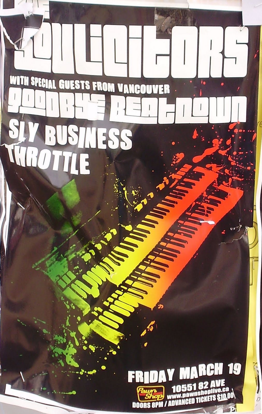 Posters similar to this one are common along Whyte Ave. There is minimal color and the name of the band is much larger than the location and date of the show. The poster does not generally give much information about what the genre of bands it is advertising. However the color that is used could be seen as a symbol of more upbeat music. It is not typical of metal bands to use rainbow coloring in their posters. The other kind of poster that is common are the ones, which have no color and are strictly black and white. The vast majority of posters that were along Whyte Ave had no color. There is also often a photo of the band standing together in an attempt to look nonchalant in the posters.

This tactic is used to make a band appear more authentic. For some of them it is more successful than others. It is a default idea for advertising. The cost of taking a picture of a band and turning it into a poster would be much less than having a poster designed. The appearance of the posters suggests that small amounts of money were used to make them. The low-budget posters cater to the people living in the area. There are many students and youth that frequent Whyte Ave. For many of them, a show that costs $10 is more appealing than a concert with ticket prices starting at $80. The culture viewing the posters has some effect on the kinds of posters being advertised. You see very few of the high-gloss colorful posters that often advertise bands playing at Rexall. When those kinds of posters are used, they tend to stand out amongst the less commercialized posters. The range of bands advertised shows the diversity of musical acts on Whyte and throughout Edmonton. There are bands that play heavy metal, reggae, jazz and many other genres.
~Elizabeth Wylie
Works Cited:
Hawkins, Brian. 2005. Cinematography: Position. Real-time Cinematography For Games, 3-52. Hingham, Mass.:Charles River Media.
Sturken, Marita and Lisa Cartwright. 2009. Practices of Looking: An Introduction to Visual Culture. New York: Oxford University Press.
Photo Credits:
Photos of posters taken by Clare Acheson, Albert To, and Elizabeth Wylie.
Åkerlund, Jonas, Cherrytree Records, and Interscope Records. 2009. Still photo of Lady GaGa. Telephone.
Calgary Examiner. http://www.examiner.com
Hohoho Gifts. http://www.hohohogifts.com
Katy Perry Photoshoot. 2009. Esquire, April 2009.
No2emo. http://www.no2emo.com
Tech Banyan. http://www.techbanyan.com
Group Members:
Clare Acheson, Albert To, and Elizabeth Wylie
No comments:
Post a Comment